01 Dec 2021
Figma and our design process
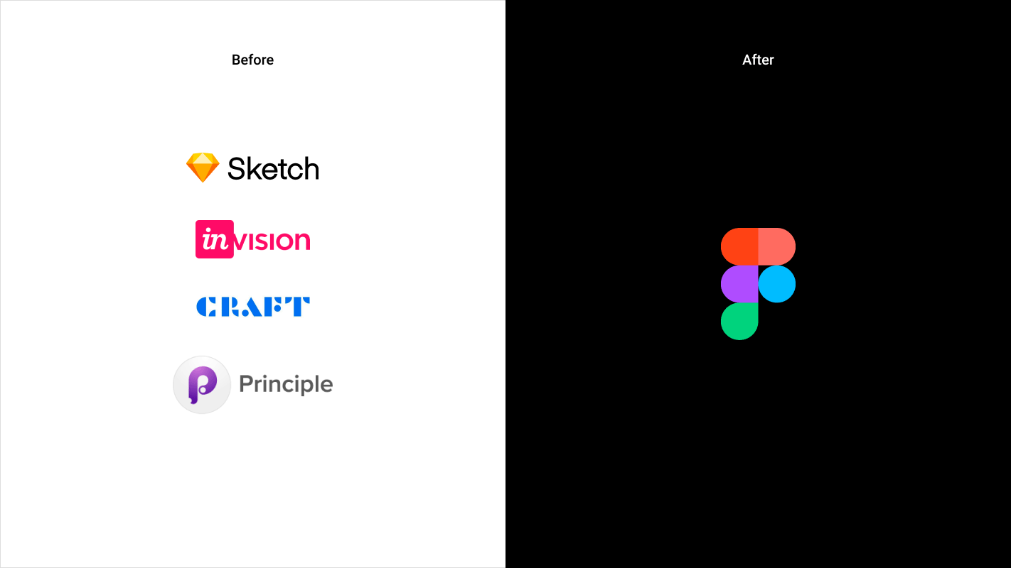
When our design team made the move from Sketch to Figma in 2019, the tool showed promising features to help with our design process. 2.5 years later, it’s not even a fair contest anymore. Some of us use Figma all day every day, 5 days a week, it’s become so good we could even have a go during the weekends. 🤓
2.5 years is a long time, and we’ve slowly but surely discovered every new feature, submenu and plugin Figma has to offer, always trying to make the most of it and make our process as smooth and consistent as ever. Now, how can a design tool make our lives so much easier you ask? Let me explain.
Auto layout and wireframing
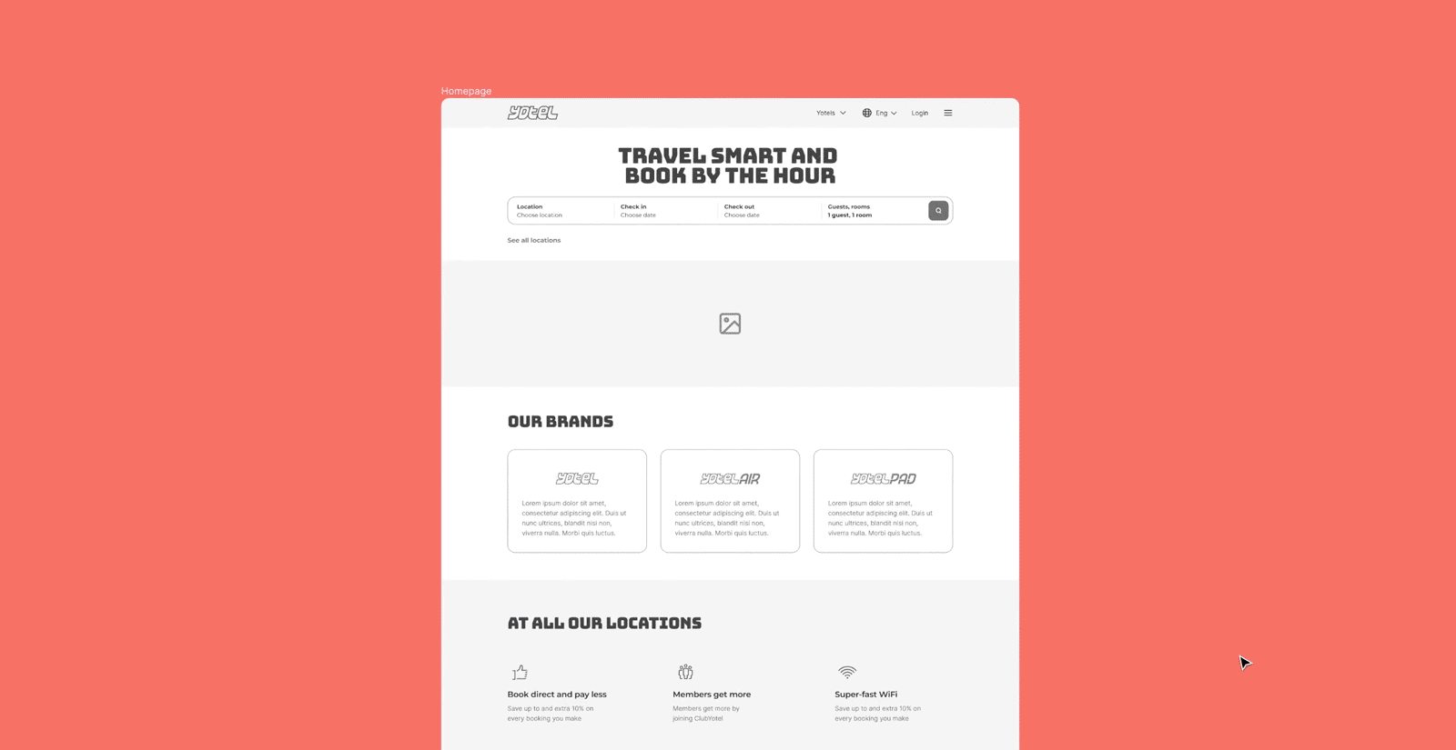
It all starts with UX. Although we still love our Mural boards for workshops, we now create our wireframes exclusively in Figma.
On projects that are fully component-based, we start by creating all the different paragraph types and page headers, as part of our process of delivering platforms with Drupal.
The auto-layout feature has allowed us to focus on design first. Once components are set up, Figma can take the back seat and our designers can freely play around with layouts, making changes on the spot when exchanging with clients or users. This helps with the ideation process, as well as making sure consistency is kept throughout : even in UX, every component is an instance of a master component, on which changes affect all the different pages.
Variants & design system
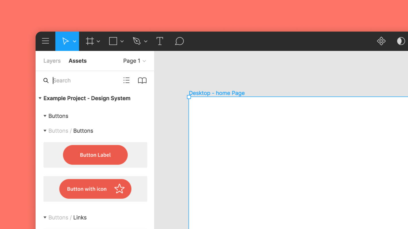
As good as Figma is with wireframing, it really shines when creating the final product UI that will be handed over our own in house development team. The first step has always been creating a consistent and accessible design system, and Figma has made it easier than ever.
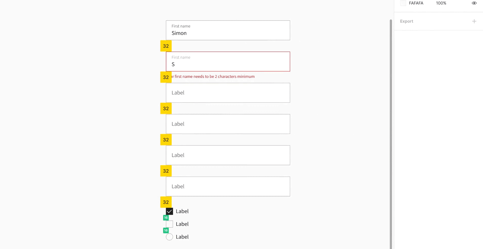
It is of course an amazing tool for creating libraries, grids, colour and text styles. But some features have allowed us to take our game to the next level when creating all sorts of components: CTAs, inputs, dropdowns, tabs and many more.
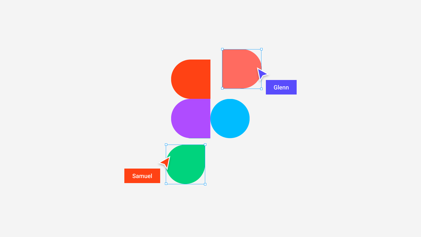
The first is one we've already mentioned, Auto-layout. It has become the default way to build any component of a design system, so that we never have to worry again about resizing, padding, margins. But when the Variants feature dropped over a year ago, this took things to the next level. Each state/screen size/colour of a component can leave under the same master component, as variants. This allows for much cleaner and tidier libraries, as well as allowing us to quickly change between variants when putting screen together. Oh, and it's also a game changer for prototyping, but more on that later...
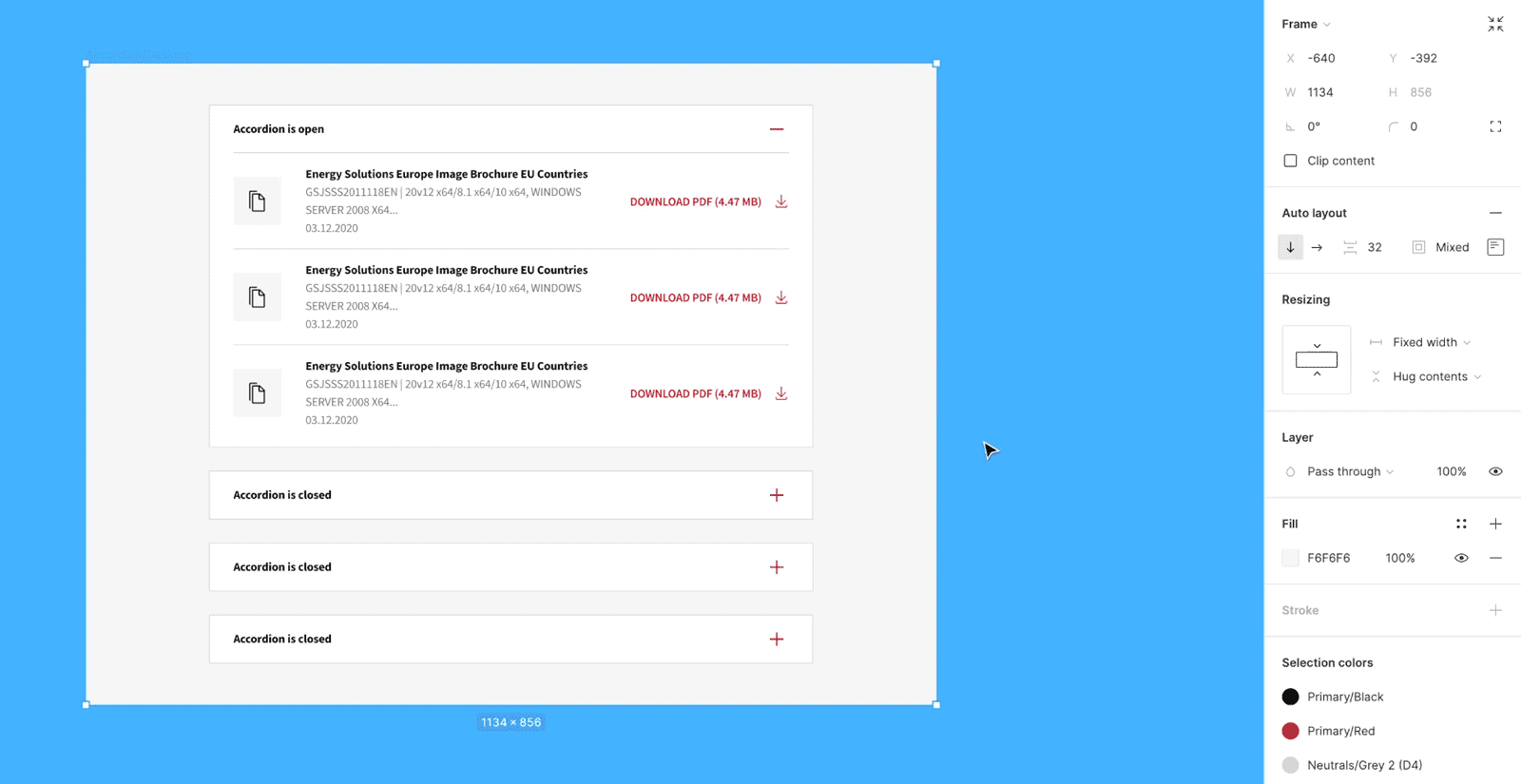
Constraints, auto-layout & components
Once those design system foundations have been put together, our team can start looking at designing bigger components (called organisms in an atomic design system). And once again, by combining the use of auto-layout, variants and constraints, we are able to build responsive, adaptive and consistent components, ready to be mocked up with any content, in any situation.
This allows us to communicate behaviours in function of screen width to Front-End developers, as well as allowing us to quickly and automatically mock up those components in any situation, without having to worry anymore about manually updating the component’s height when adding a lot of text for example (yes, this was how it was done not so long ago 👀).
Overall, we now have design systems with components that adapt to their content, can easily switch between states and overall makes having a consistent and well built UI simpler than ever. Yes, it’s a game changer.
Interactive variants & prototyping
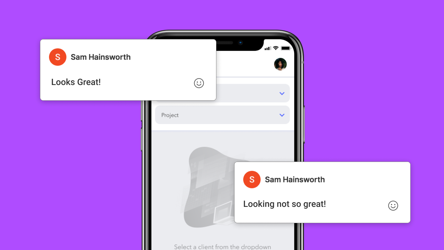
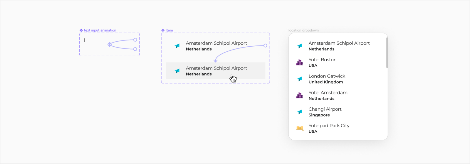
Once the designs are complete, the last part of our UI process is to create prototypes of components with complex behaviours. This helps communication with Front-End developers, sharing information about micro-interactions, transition animations - does the transition appear with a fade-in? Appear instantly? Should motion easing be applied to it? These are elements that will help the user’s interactions with UI elements, lead the eye to the next element, help with decisions. It’s finessing, but eventually makes the difference between a journey that feels smooth and one that can feel confusing at times. This makes prototypes a tool of communication between designers and developers.
By making prototypes as close to the final product as possible, it will also help designers and clients to run testing sessions with users or internally. To either validate a solution or to ideate further on the user’s journey.
The introduction of the interactive variants feature in Figma has made this process much easier, and goes a long way into helping us prototype the most realistic interactions possible. It allows us to set interactions between master components that will affect all instances of the component in the prototype. This means pickers can each automatically have their own hover state for instance, and we also have been pushing the feature with the use of custom delay animations, to replicate the behaviour of a text input cursor. All together, this helps give prototypes a lot of realism, and replicate the feeling of using the final product.
Just over 5 years ago, designers would build screens and components in Photoshop. Then we moved to tools custom made for product design, starting with Sketch, and our workflow drastically improved. We have been using Figma for more than 2 years now, and we can’t wait to see what the future holds, test new tools, features, to bring designs closer to reality, users, clients, developers…
No tool will be perfect, but we’re having more and more fun using them, that’s for sure.