06 Aug 2021

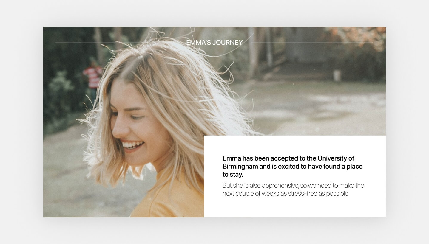
Helping new students get off to the best possible start

With this year’s A-level results announcement comes a new wave of students embarking upon their university careers. Whilst this is unquestionably a time of excitement and possibility, it can also be pretty daunting. For many, it will be their first time living away from home, and could well mean a move to a new city, or even country. It was this consideration that underpinned a recent brief from a client of ours, a Student Accommodation provider who was looking to fully streamline their new resident onboarding program, in order to make the lead up to move-in-day as simple and supportive as possible.


The Brief

Taking the period of time between booking and arrival, there was a need to tackle the information overload faced by their new customers. During this crucial introduction to life at their new student home, bookers were receiving an overwhelming array of communications across different channels before they arrived at their residence. We worked with our client to devise a digital pre-arrivals program that would:

  • Support residents in the completion of follow-up admin tasks relating to their booking
  • Encourage new-bookers to download the free residents’ app so that they can start benefiting from it’s features immediately
  • Provide clear communication in the lead up to arrival day
  • Reduce the number of pre-arrival enquiries
  • Make arrival day check-in as quick and seamless as possible
  • Ultimately, make each new resident feel part of the family, even before they physically arrive on site

Our Approach

Our first task was to deconstruct the pre-arrivals journey, clearly mapping all tasks that need to be completed and all of the information that ‘must’, ‘should’ and ‘could’ be communicated to new recruits. To do this, we brought together key team members’ across the business’s marketing, digital and resident liaison teams and worked together to build a clear picture of the current process and our shared ambition for the new, improved experience.

From here we were able to embark upon the solution design phase. Simplicity was key to our approach which looked to streamline the wealth of onboarding communications into a single source via the resident app and distributing only when relevant. The ultimate solution we were able to deliver included:

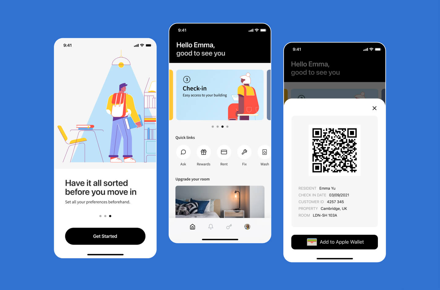
  • A program of timely push notifications direct to a users, prompting them to complete tasks or discover helpful information
  • The addition of a progress gate within the app that provides users with a visual representation of how close they are to completing their onboarding
  • A digital Tenancy Agreement with downloadable mobile copy
  • An interface that houses the full suite of Read and Sign steps in one handy place
  • Access to a QR code via the app that enables residents who have completed all onboarding steps to check-in by simply scanning their code upon arrival at their residence

Using clever tech, and well-timed comms, we were able to support students in getting off to the best possible start

Our ultimate ambition over the course of this project was to give residents the best start to their year as possible. At the heart of this lies student well-being, and ensuring that each new booker feels supported from the moment they confirm their purchase. We hope that this digital pre-arrivals program reduces confusion and creates a more manageable onboarding experience for every new booker this year!

Making our experience work for you

We have a huge range of experience in the PBSA + Education sector through our work with IQ Students, GSA, Scape, University of Salford and more. We're experienced in designing and building platforms that can make life better for your customers.

If you're interested in working with us to devise smart strategies that will improve your connection with your audience, don't hesitate to get in touch.

29 Jan 2021

Web Accessibility Series: Part 1 - Colour Accessibility

Kicking off Part 1 of Catch’s new web accessibility series exploring the different ways we can make the internet accessible for everyone.
 

This month the Experience Design (XD) team at Catch is kicking off the first segment of our Accessibility Series, aimed at positioning accessibility as less of a challenge that needs to be tackled, and instead encouraging designers to embrace accessibility and view it as an integral part of their process. Each part of the series will provide an overview of our main learnings and provide relevant resources and advice to help you stay on top of accessibility. Part 1 covers how to address colour accessibility in our work.


Alt text: visual of overlapping circles in different colours and patterns

Overview 

Before we answer that question, we first want to provide a brief overview of the history of Accessibility Guidelines. 

In 1999, the World Wide Web Consortium (W3C) created a set of guidelines called the “Web Content Accessibility Guidelines” as part of the Web Accessibility Initiative (WAI). The mission of the WAI is to lead the Web to its full potential of usability, enabling people with disabilities to participate equally on the Web.

Alt text: image of cartoon cat with words like inaccessible? Wow? Huh? Floating around them

What is colour accessibility?

Colour accessibility is the inclusion of enough contrast between the foreground text colour and the background colour to ensure text and iconography is easily recognisable. 

It also includes guidelines on how to distinguish between elements with colour, for example, in bar charts. Choosing different colours for different elements is not enough though. Anything that is indicated by colour should have a secondary way for it to be distinguished, for example a pattern, like in the example below.

Alt text: image of a bar chart with the appropriate colour contrast and patterns on each element to show how to be accessibility compliant

Why do we follow these guidelines?

We follow these rules to make the internet more accessible for people with a decreased ability to see colour, or a decreased ability to tell colours apart from one another. Colour blindness is more accurately referred to as Colour Vision Deficiency (CVD) and occurs in 8% of males and 0.5% of females worldwide, constituting a significant portion of the population.

(Source: Geri Coady, “Color Accessibility Workflows”)

Three Main Learnings


1. Guidelines are great, but also user test when possible

Despite all intentions to ensure guidelines match real user’s needs, this is not always the case. Take the example below. At first glance, you may think that there’s no way the white text over the busy and colourful background is legible. But according to the Accessibility Guidelines, in the below image “all texts meet AAA colour contrast requirements.”

Alt text: image of text over a busy colourful background that doesn’t seem accessible but according to the guidelines passes, showing a discrepancy

This is because “when background images are used, automated tests aren’t reliably able to check for minimum contrast of text against the image - especially if the image is a photograph or drawing where the text is placed over the image, and (2) situations in which depending upon context such as text becoming incidental because it is part of an inactive user interface component or is purely decorative or part of a logo” 

(Source: Challenges with Accessibility Guidelines Conformance and Testing, and Approaches for Mitigating Them). This reveals a limitation of available accessibility testers online and a need for making improvements.

User testing for accessibility is a good solution to solving the issue of guideline discrepancies in what’s said to help users and what is actually helpful.

2. We have a lot to learn. 

Despite the introduction of the Web Content Accessibility Guidelines in 1999, there is still a long way to go in terms of ensuring the internet is fully accessible. For example, 86.3% of home pages in February 2020 lacked sufficient colour contrast. Keeping in mind the percentage of males and females that have Colour Vision Deficiency (CVD), totalling around 300 million people, we know that those in need of accessible websites are not receiving the best user experience possible across the internet.

Alt text: illustration of a blind man, a voice command logo, and a cell phone

3. We should all be champions of accessibility. 


Accessible Sites have improved performance

Accessible websites are inherently more usable, providing a better experience for your site visitors. This is crucial given that 88% of users are less likely to return to a website after a bad user experience (Source: UXCam) Lower bounce rates, higher conversions, and less negative feedback likely associated with a more accessible website should in turn rank your site higher in search engines, thus increasing your chance of reaching more people. 


It’s a financial liability

Lawsuits have been brought against multiple organisations that did not provide accessible websites. An article titled “Companies are Losing Web Cases: Spend Money on Web Access, not Lawyers,” court cases were filed by blind people against Blick Art Materials, Five Guys, Winn-Dixie, and Hobby Lobby crafts. In all of these cases the plaintiffs won significant compensation from these organisations. The article title says it all. It’s worth investing in your site’s accessibility. 


It’s the right thing to do

The last, and most important reason for improving your site’s accessibility, is that everyone deserves access to the internet in a way that supports their needs. This is echoed in a statement by the United Nations which recognises the access to information and communications technologies as a basic human right.

Alt text: illustration of a guy giving a thumbs up and “you’re a okay” spelled with three a’s before it, next to him

Conversations around accessibility should be had frequently when kicking off new projects with both internal teams and clients to ensure everyone is invested in creating the best possible user experience. The W3C has resources to help you make a business case for improving your organisation’s accessibility that you can find here

Our team at Catch has expertise in designing and building accessible websites, having worked at the highest level of WCAG accreditation. We’ve worked with Scope (the pan-disability charity), accredited by The Shaw Trust for AAA accessibility, to design and build a range of products and are currently working with the Royal National Institute of Blind People to reimagine their digital presence with accessibility as a key focus. 


If you need help starting conversations around accessibility or are ready to get to work, please get in touch. And don’t forget to follow us on Instagram for more accessibility related content!


Start a conversation

0207 494 3554
or
newbiz@catchdigital.com