06 Dec 2016
SES: Drupal 8, front-end teardown
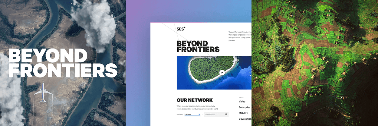
We’ve just designed and built a new website for the world-leading satellite operator, SES. SES connects and enables broadcast, telecom, corporate and government customers, and enriches the lives of billions of people worldwide.
We’re really proud of how it’s turned out, and as it’s one of the first batch of high-profile large Drupal 8 websites, we’ve been asked by a wide range of people about our technical approach to building a complex site using the latest version of Drupal.
You can read our case study here on the project as a whole, but here is Stuart Wilson, Head of Frontend Development at Catch to explain a little more around our front-end approach:
“The sheer scale of the SES website demanded a scalable and comprehensive front end system. As a team we approached the transition from design to code by creating a static style guide of individual components which would then be used to power the Drupal 8 website.
Our modular CSS was written in SASS using NPM to run build scripts and wrapping it up with PostCSS’ Autoprefixer for greater resilience to browser inconsistencies. Using BEM syntax and championing an OOCSS approach allowed us to write configurable componentry which was open to extension, but closed to core modification which meant that QA testing could happen earlier on in the build.
“The sheer scale of the SES website demanded a scalable and comprehensive front end system."
STUART WILSON, HEAD OF FRONT END DEVELOPMENT AT CATCH
Thanks to Drupal 8’s use of the Twig templating engine, we could test the flexibility of our HTML templates using mock data which was then swappable for real content from the CMS. This created a unified theming workflow with clear ownership between the front and back end of the website and helped reduce code overhead whilst instilling scalability within the UI.
Thanks to our modular approach, we were able to utilise Drupal Paragraphs to promote greater flexibility across content types in the CMS, enabling SES to realise any combination of page designs they required.”
Visit www.ses.com and stay tuned for future SES developments. We’re continuing to work with the team in Luxembourg on increased website functionality and a range of other exciting digital products.