Working with the Premier League club's fans to bring the digital experience back on-side
The challenge
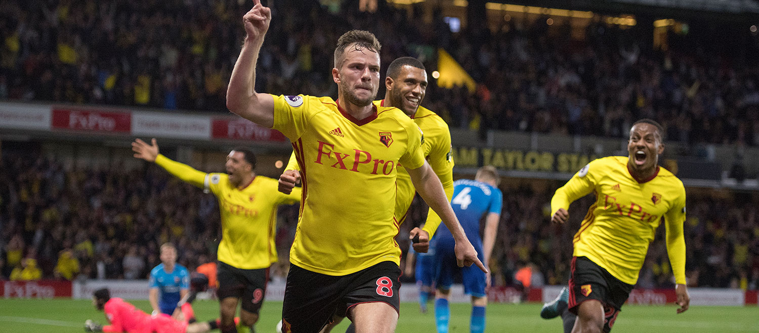
Watford FC are known as a club who put fans at the heart of everything they do. So when a recent website refresh led some fans to feed back that the club’s online-experience wasn’t offering what they wanted, the club listened.
After a competitive pitch, Catch were brought onboard to bring the digital experience back on-side by overcoming these challenges;
Lack of understanding of audience and needs - Whilst the Watford team had an anecdotal understanding of their audience, they had little quantitative evidence or detailed insight into site performance to support this.
Felt as if it was left 'unfinished' - The confusion that a lack of navigation and content surfacing provided left users under the impression that the website was still under construction and not finished. Watford’s previous website, although in need of a makeover, was effective in the way that it functioned.
The fans were not 'fans' - Fans were not in fact fans of the website itself, easily losing their way and feeling that the design and branding was not reflective of the club. Bounce rate across the site was high (particularly on mobile) and fewer than a quarter of visitors were scrolling down the homepage to reach key content links.
Confusing user-journey - The user-journey for a fan visiting the site was confusing and there appeared to be a lack of direction within the site to enable fans to easily consume the content that they were most interested in. The hierarchy of content on key pages, such as the homepage, wasn’t aligned to their audience needs. This lead to fans being frustrated and clicking around the site aimlessly, trying to reach an area that they were looking for.
No news archive - Watford FC are club that’s steeped in history and have experienced some incredible sporting moments in the not so distant past. They’ve consistently produced news articles for a number of years but there was no centralised place for news to be stored and historic news articles to be viewed. This lead fans to feel that the new site had felt as if that they’d lost a little bit of their ‘identity’ as a Club.
There’s no better source for fans to receive the latest club news than directly from their teams website. However a lack of a centralised news area that surfaced the most relevant content, meant that fans were going elsewhere to obtain this information.
Approach
Focus groups - We conducted a focus group held at Vicarage Road with some lifelong Watford FC supporters. The group varied in age, gender and technical ability which enabled us to gain a broad picture of what’s working well, what needed to be improved and what would be useful additions to the site to help increase engagement.
The findings that were taken from the Focus Group were taken onboard and applied to the concept creation, alongside the user testing research, to help ensure that the end solution that was going to be delivered was directly addressing the main troubles that fans were experiencing whilst using the site.
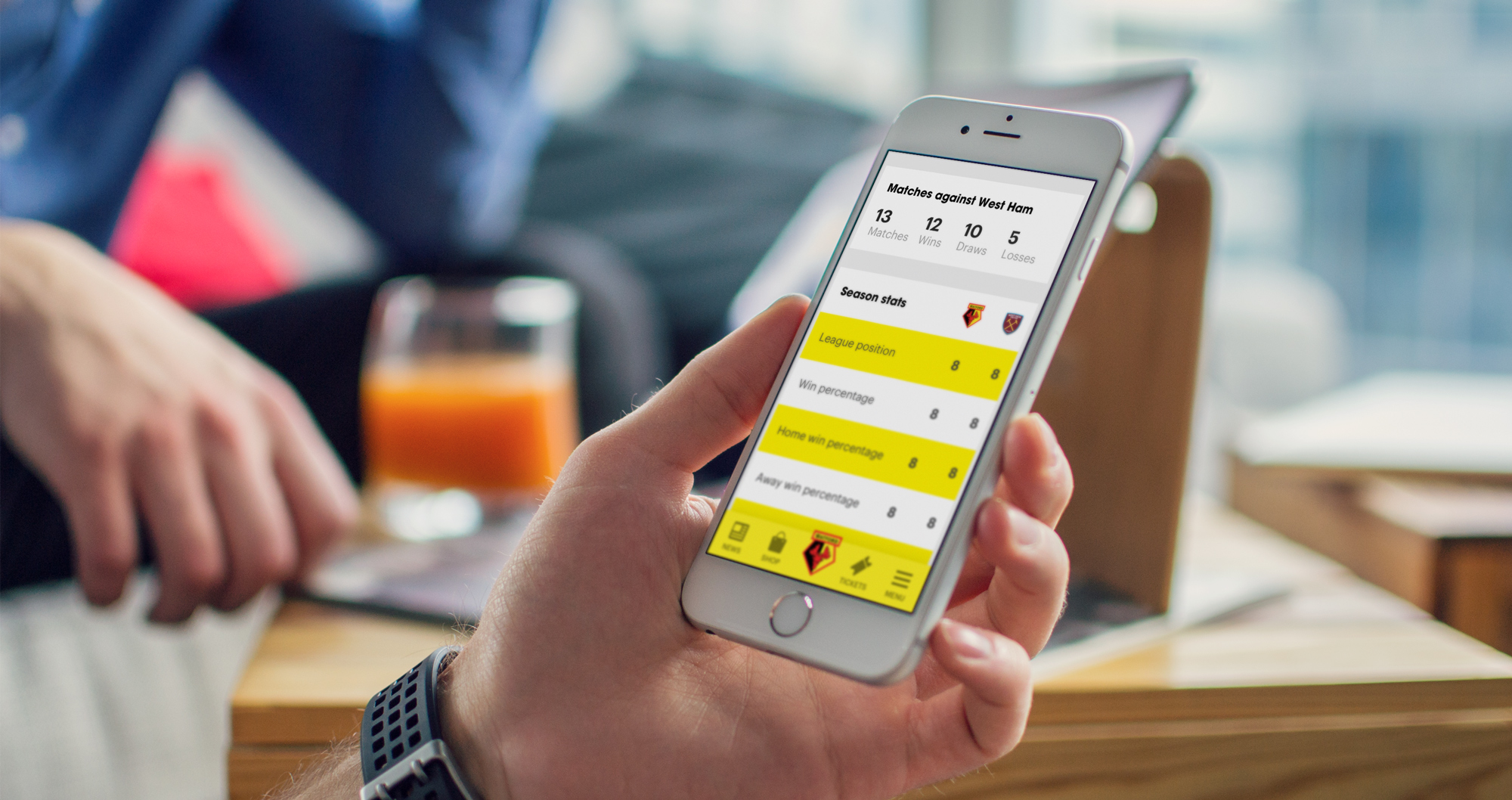
Competitor analysis - Watford FC were one of only two Premier League teams that didn’t lead with ‘news’ or include it within their primary navigation. Research conducted indicated that ‘news’ was by far the most popular reason that fans would visit the site.
Other Premier League clubs also offered users the ability to view and refine searches for archived news which can be explored back through previous seasons. This functionality provided users with the ability to navigate through older articles and media from their favourite moments of recent years.
Another popular approach to showcasing content amongst their Premier League rivals, was to have all of the key content (i.e next match, buy tickets and Premier League table) as prominent as possible on the homepage. These key CTA’s within the existing site needed to become more prominent to give the user the opportunity to quickly navigate to a key section or undertake a key task. This was something that needed to be carefully considered in the re-design.
GA review & heatmaps - As a first step, we examined in detail WFC site performance and how users were interacting with the site. Using Google Analytics, Hotjar heatmaps and visitor recordings, we were able to draw some key insights, identifying points of weakness and opportunities for improvement.
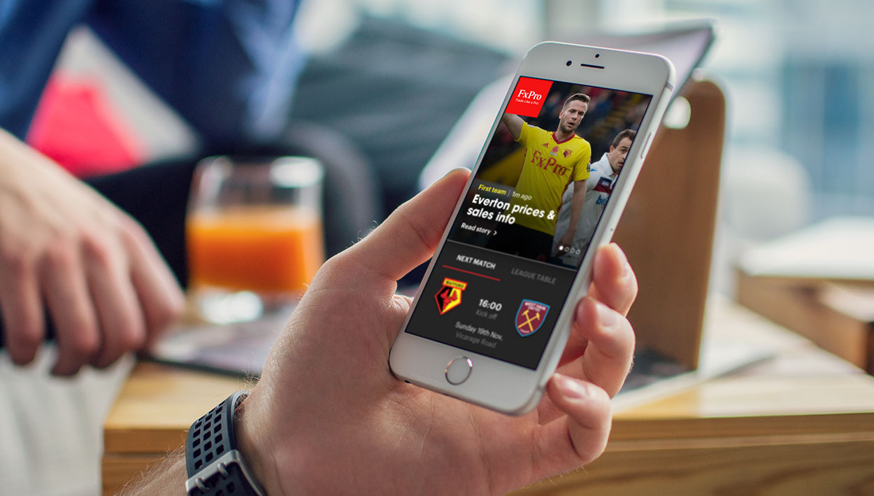
It became clear for example, that despite the majority of the site traffic coming from mobile and tablet, site performance was much weaker for these devices with a higher bounce rate, lower dwell time and lower engagement. Insight into popular content and top landing pages also enabled us to identify the key areas of the site where improvements were likely to achieve the maximum ROI.
Online surveys - We wanted to gain direct insight into user’s onsite experience in order to better understand their behaviour and motivations, and to verify the popularity of potential new features. Hotjar polls were implemented, designed to appear at the point a users displayed signs of exiting. Users were asked a series of questions about their experience of the site, ease of use and the sort of content and features they would like to see.
After running polls for just over a week, we received almost 1,500 fully completed surveys, giving us a strong data set for analysis. Over 25% of fans made comments about the site’s UX & UI, expressing frustrations about convoluted user journeys and missing content. Respondents also displayed an appetite for more player and staff information as well as easier access to video content and match day highlights. The key takeaway however; was the users’ desire for more news and the ability to access past news articles and club heritage content.
User testing - It's always important for us to validate our designs by testing them on a wider audience. We used an online platform to remotely test the clickable prototype with different participants. Potential users of Watford FC website were asked to complete a series of tasks too. The tasks were chosen based on the key user journeys that we discovered and sessions were recorded and analysed to identify areas for improvement on the prototype. Based on the feedback received we iterated on our designs.
Heat maps - We ran heat maps across Watford’s key pages to find out which content fans were most interested in and interacting with the most. From our findings we were able to promote this content rather than expecting the user to scroll down the page to find what they were looking for.
Outcome
Re-visited application of brand - From user research and focus groups we found out that most fans were proud of the Watford brand and felt that it needed to be carried across on to the site more. We really wanted to create a place where the fans would feel at home, so we first revisited the brand guidelines, while at the same time taking inspiration from Vicarage Road Stadium surroundings and news driven websites. Overall, we kept the design simple and increased the use of the Club colours throughout the site whilst ensuring that the site remained on brand.
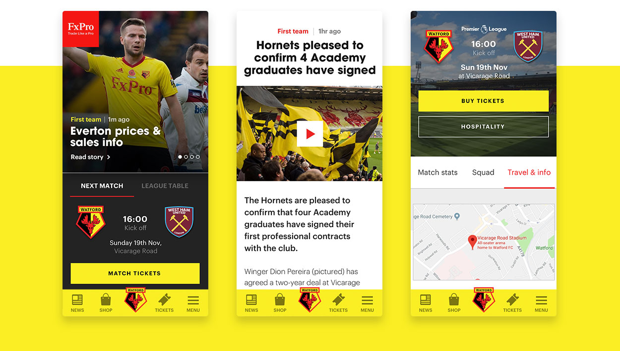
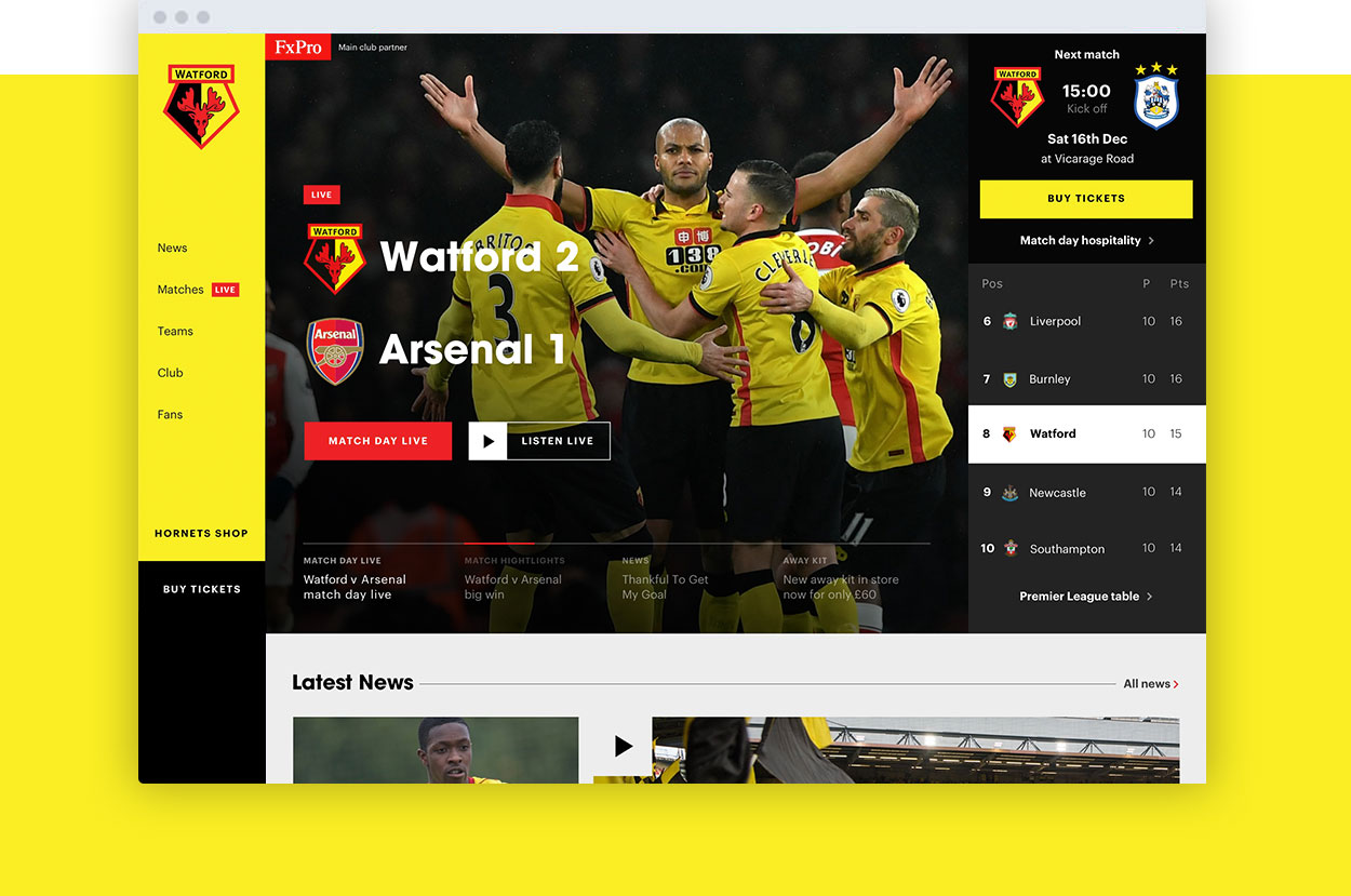
Re-structure of site IA + homepage structure - The overall re-structure of the home page was lead by Watford fans rather than assuming that we know what they wanted. Every iteration of UX and design was user tested with fans and users to ensure content was accessible and positioned correctly within the page.
We made sure that the homepage acted as a central hub for fans, where they could get an overall insight into how their team was doing, showcasing featured news, next match updates and a brief view of where Watford are in the league, all within the very top section of the site.
UX (navigation) - The feedback received from polls and focus group clearly indicated that one of the most important areas to improve was the main navigation. We discovered that the fans found the existing site difficult to navigate through. The menu with categories and subcategories was hidden and was structured in a way that wasn’t helpful for users. We decided to make the menu visible and give users instant access to the items within the menu. On every page we added the auxiliary navigation which helps fans with reaching a specific content type within each section more easily. Our solution was remotely tested with participants. We received positive feedback which helped us to spot areas for improvement (e.g. names for categories, visual separation of the menu).
“Our UX/UI and Technical teams worked in close collaboration to ensure the redefined User Experience was applied to the existing site back-end architecture, built on Drupal”
Gary Greenleaf, Technical Director, Catch
2nd theme - The second theme is part of the solution for our redesign so it goes with the re-visiting the application of the brand. After working with the inherited code base for a couple of months we decided that it would be best to create a separate theme for this redesign, instead extending the old theme. This allows us to improve efficiencies within the theme and reduce code duplication over time as we switch each section of the website over to the new theme, with the end goal of having just one theme running. This is all controlled using Drupal 8’s ThemeNegotiator class (You can check out the interface here) and the configurations for this are stored within Drupal 8’s configuration management to allow the changes to be applied at the same time as the new templates and styles.
Caching improvements - With matchday live growing in popularity this season the implementation we inherited was facing performance issues due to the responses not being cached. With this slowing down the website we investigated where the issues were and found that the match day live feed was serving a non-cached json response. By changing this response to be cached for a small period of time, we reduced the traffic that was going to the web servers during match day live by 78%. (Comparing 6/1/2018 to 10/2/2018)
News area - As a central place for news was the solution that our research pointed to, we created a news listing using drupal views which allows the user to filter content based on taxonomy terms which users understand. We deployed the new fields and taxonomy vocabularies first to allow Watford to tag their content, so it was ready for when the news area was released. This uses the views infinite scroll module to allow more items to be loaded in to the page via ajax.
“Catch don’t indulge in some of the usual jargon-speak and fussing that other agencies waste time on.
Our partnering on a project to reimagine our main digital presence was efficiently handled and they remain a team we recommend to others in our difficult-to-penetrate industry”
Richard Walker, Head of Supporter Communication & Sales
19%
Increase in sessions55%
Pages/session increase-78%
Reduced match day server loadRelated news and work

Econsultancy Top 100 Agency
We’re proud to announce that we feature in Econsultancy’s Top 100 Digital Agencies Report
Acceptance without exception
A new digital presence for Stonewall, the leading charity for lesbian, gay, bi and trans equality

Digital transformation for a global payment giant
Digital transformation for the global leader in payment processing technology